"/><stop offset="1" stop-color="rgb(255, 100, 165)"/></linearGradient></defs><g d="M 0 0 L 60 0 L 60 60 L 0 60 Z M 9 60 C 4.029 60 0 55.971 0 51 L 0 9 C 0 4.029 4.029 0 9 0 L 51 0 C 55.971 0 60 4.029 60 9 L 60 51 C 60 55.971 55.971 60 51 60 Z M 42.974 11.215 C 43.145 11.215 43.331 11.198 43.535 11.164 C 43.773 11.096 44.011 10.942 44.249 10.704 C 44.385 10.568 44.538 10.5 44.708 10.5 C 44.98 10.5 45.184 10.653 45.319 10.959 L 49.347 18.412 C 49.449 18.616 49.5 18.77 49.5 18.872 C 49.5 19.144 49.364 19.348 49.092 19.484 L 46.951 20.658 C 46.747 20.76 46.577 20.811 46.441 20.811 C 46.237 20.811 46.05 20.658 45.88 20.352 L 45.727 20.046 C 44.878 18.344 43.654 17.136 42.057 16.422 C 40.46 15.707 38.624 15.349 36.551 15.349 L 34.053 15.349 L 34.053 41.588 C 34.053 42.949 34.308 44.106 34.818 45.059 C 35.327 45.978 36.228 46.437 37.519 46.437 L 37.876 46.437 C 38.386 46.437 38.641 46.692 38.641 47.203 L 38.641 48.734 C 38.641 49.245 38.386 49.5 37.876 49.5 L 22.174 49.5 C 21.664 49.5 21.41 49.245 21.41 48.734 L 21.41 47.203 C 21.41 46.692 21.665 46.437 22.175 46.437 L 22.481 46.437 C 23.772 46.437 24.673 45.978 25.182 45.059 C 25.692 44.106 25.947 42.949 25.947 41.588 L 25.947 15.349 L 23.449 15.349 C 21.376 15.349 19.541 15.707 17.943 16.421 C 16.346 17.136 15.122 18.344 14.273 20.046 L 14.12 20.352 C 13.95 20.658 13.763 20.812 13.559 20.812 C 13.423 20.812 13.253 20.761 13.049 20.659 L 10.908 19.484 C 10.636 19.348 10.5 19.144 10.5 18.872 C 10.5 18.77 10.551 18.616 10.653 18.412 L 14.68 10.959 C 14.85 10.653 15.054 10.5 15.292 10.5 C 15.462 10.5 15.615 10.568 15.751 10.704 C 15.989 10.943 16.21 11.096 16.414 11.164 C 16.651 11.197 16.855 11.215 17.026 11.215 Z" fill="transparent" height="60px" id="wnIU_RgRP" width="60px"><path d="M 0 0 L 60 0 L 60 60 L 0 60 Z" fill="transparent" height="60px" id="g9vASv_I0" width="60px"/><path d="M 9 60 C 4.029 60 0 55.971 0 51 L 0 9 C 0 4.029 4.029 0 9 0 L 51 0 C 55.971 0 60 4.029 60 9 L 60 51 C 60 55.971 55.971 60 51 60 Z" fill="rgb(254, 254, 254)" height="60px" id="Zi9UWh_Wu" width="60px"/><g d="M 32.474 0.715 C 32.645 0.715 32.831 0.698 33.035 0.664 C 33.273 0.596 33.511 0.442 33.749 0.204 C 33.885 0.068 34.038 0 34.208 0 C 34.48 0 34.684 0.153 34.819 0.459 L 38.847 7.912 C 38.949 8.116 39 8.27 39 8.372 C 39 8.644 38.864 8.848 38.592 8.984 L 36.451 10.158 C 36.247 10.26 36.077 10.311 35.941 10.311 C 35.737 10.311 35.55 10.158 35.38 9.852 L 35.227 9.546 C 34.378 7.844 33.154 6.636 31.557 5.922 C 29.96 5.207 28.124 4.849 26.051 4.849 L 23.553 4.849 L 23.553 31.088 C 23.553 32.449 23.808 33.606 24.318 34.559 C 24.827 35.478 25.728 35.937 27.019 35.937 L 27.376 35.937 C 27.886 35.937 28.141 36.192 28.141 36.703 L 28.141 38.234 C 28.141 38.745 27.886 39 27.376 39 L 11.674 39 C 11.164 39 10.91 38.745 10.91 38.234 L 10.91 36.703 C 10.91 36.192 11.165 35.937 11.675 35.937 L 11.981 35.937 C 13.272 35.937 14.173 35.478 14.682 34.559 C 15.192 33.606 15.447 32.449 15.447 31.088 L 15.447 4.849 L 12.949 4.849 C 10.876 4.849 9.041 5.207 7.443 5.921 C 5.846 6.636 4.622 7.844 3.773 9.546 L 3.62 9.852 C 3.45 10.158 3.263 10.312 3.059 10.312 C 2.923 10.312 2.753 10.261 2.549 10.159 L 0.408 8.984 C 0.136 8.848 0 8.644 0 8.372 C 0 8.27 0.051 8.116 0.153 7.912 L 4.18 0.459 C 4.35 0.153 4.554 0 4.792 0 C 4.962 0 5.115 0.068 5.251 0.204 C 5.489 0.443 5.71 0.596 5.914 0.664 C 6.151 0.697 6.355 0.715 6.526 0.715 Z" fill="transparent" height="39px" id="sJZgEX_6w" transform="translate(10.5 10.5)" width="39px"><path d="M 32.474 0.715 C 32.645 0.715 32.831 0.698 33.035 0.664 C 33.273 0.596 33.511 0.442 33.749 0.204 C 33.885 0.068 34.038 0 34.208 0 C 34.48 0 34.684 0.153 34.819 0.459 L 38.847 7.912 C 38.949 8.116 39 8.27 39 8.372 C 39 8.644 38.864 8.848 38.592 8.984 L 36.451 10.158 C 36.247 10.26 36.077 10.311 35.941 10.311 C 35.737 10.311 35.55 10.158 35.38 9.852 L 35.227 9.546 C 34.378 7.844 33.154 6.636 31.557 5.922 C 29.96 5.207 28.124 4.849 26.051 4.849 L 23.553 4.849 L 23.553 31.088 C 23.553 32.449 23.808 33.606 24.318 34.559 C 24.827 35.478 25.728 35.937 27.019 35.937 L 27.376 35.937 C 27.886 35.937 28.141 36.192 28.141 36.703 L 28.141 38.234 C 28.141 38.745 27.886 39 27.376 39 L 11.674 39 C 11.164 39 10.91 38.745 10.91 38.234 L 10.91 36.703 C 10.91 36.192 11.165 35.937 11.675 35.937 L 11.981 35.937 C 13.272 35.937 14.173 35.478 14.682 34.559 C 15.192 33.606 15.447 32.449 15.447 31.088 L 15.447 4.849 L 12.949 4.849 C 10.876 4.849 9.041 5.207 7.443 5.921 C 5.846 6.636 4.622 7.844 3.773 9.546 L 3.62 9.852 C 3.45 10.158 3.263 10.312 3.059 10.312 C 2.923 10.312 2.753 10.261 2.549 10.159 L 0.408 8.984 C 0.136 8.848 0 8.644 0 8.372 C 0 8.27 0.051 8.116 0.153 7.912 L 4.18 0.459 C 4.35 0.153 4.554 0 4.792 0 C 4.962 0 5.115 0.068 5.251 0.204 C 5.489 0.443 5.71 0.596 5.914 0.664 C 6.151 0.697 6.355 0.715 6.526 0.715 Z" fill="url(%23KbpzL6PmD-1929859876-linear-gradient)" height="38.999999999999986px" id="KbpzL6PmD" width="39px"/></g></g></svg>)
"/><stop offset="1" stop-color="rgb(255, 100, 165)"/></linearGradient></defs><g d="M 42.974 11.215 C 43.145 11.215 43.331 11.198 43.535 11.164 C 43.773 11.096 44.011 10.942 44.249 10.704 C 44.385 10.568 44.538 10.5 44.708 10.5 C 44.98 10.5 45.184 10.653 45.319 10.959 L 49.347 18.412 C 49.449 18.616 49.5 18.77 49.5 18.872 C 49.5 19.144 49.364 19.348 49.092 19.484 L 46.951 20.658 C 46.747 20.76 46.577 20.811 46.441 20.811 C 46.237 20.811 46.05 20.658 45.88 20.352 L 45.727 20.046 C 44.878 18.344 43.654 17.136 42.057 16.422 C 40.46 15.707 38.624 15.349 36.551 15.349 L 34.053 15.349 L 34.053 41.588 C 34.053 42.949 34.308 44.106 34.818 45.059 C 35.327 45.978 36.228 46.437 37.519 46.437 L 37.876 46.437 C 38.386 46.437 38.641 46.692 38.641 47.203 L 38.641 48.734 C 38.641 49.245 38.386 49.5 37.876 49.5 L 22.174 49.5 C 21.664 49.5 21.41 49.245 21.41 48.734 L 21.41 47.203 C 21.41 46.692 21.665 46.437 22.175 46.437 L 22.481 46.437 C 23.772 46.437 24.673 45.978 25.182 45.059 C 25.692 44.106 25.947 42.949 25.947 41.588 L 25.947 15.349 L 23.449 15.349 C 21.376 15.349 19.541 15.707 17.943 16.421 C 16.346 17.136 15.122 18.344 14.273 20.046 L 14.12 20.352 C 13.95 20.658 13.763 20.812 13.559 20.812 C 13.423 20.812 13.253 20.761 13.049 20.659 L 10.908 19.484 C 10.636 19.348 10.5 19.144 10.5 18.872 C 10.5 18.77 10.551 18.616 10.653 18.412 L 14.68 10.959 C 14.85 10.653 15.054 10.5 15.292 10.5 C 15.462 10.5 15.615 10.568 15.751 10.704 C 15.989 10.943 16.21 11.096 16.414 11.164 C 16.651 11.197 16.855 11.215 17.026 11.215 Z" fill="transparent" height="60px" id="ENy7giQS1" transform="translate(-9 -9)" width="60px"><path d="M 0 0 L 60 0 L 60 60 L 0 60 Z" display="none" fill="transparent" height="60px" id="ESka27RLq" width="60px"/><path d="M 9 60 C 4.029 60 0 55.971 0 51 L 0 9 C 0 4.029 4.029 0 9 0 L 51 0 C 55.971 0 60 4.029 60 9 L 60 51 C 60 55.971 55.971 60 51 60 Z" display="none" fill="rgb(254, 254, 254)" height="60px" id="GxreBo0Hb" width="60px"/><g d="M 32.474 0.715 C 32.645 0.715 32.831 0.698 33.035 0.664 C 33.273 0.596 33.511 0.442 33.749 0.204 C 33.885 0.068 34.038 0 34.208 0 C 34.48 0 34.684 0.153 34.819 0.459 L 38.847 7.912 C 38.949 8.116 39 8.27 39 8.372 C 39 8.644 38.864 8.848 38.592 8.984 L 36.451 10.158 C 36.247 10.26 36.077 10.311 35.941 10.311 C 35.737 10.311 35.55 10.158 35.38 9.852 L 35.227 9.546 C 34.378 7.844 33.154 6.636 31.557 5.922 C 29.96 5.207 28.124 4.849 26.051 4.849 L 23.553 4.849 L 23.553 31.088 C 23.553 32.449 23.808 33.606 24.318 34.559 C 24.827 35.478 25.728 35.937 27.019 35.937 L 27.376 35.937 C 27.886 35.937 28.141 36.192 28.141 36.703 L 28.141 38.234 C 28.141 38.745 27.886 39 27.376 39 L 11.674 39 C 11.164 39 10.91 38.745 10.91 38.234 L 10.91 36.703 C 10.91 36.192 11.165 35.937 11.675 35.937 L 11.981 35.937 C 13.272 35.937 14.173 35.478 14.682 34.559 C 15.192 33.606 15.447 32.449 15.447 31.088 L 15.447 4.849 L 12.949 4.849 C 10.876 4.849 9.041 5.207 7.443 5.921 C 5.846 6.636 4.622 7.844 3.773 9.546 L 3.62 9.852 C 3.45 10.158 3.263 10.312 3.059 10.312 C 2.923 10.312 2.753 10.261 2.549 10.159 L 0.408 8.984 C 0.136 8.848 0 8.644 0 8.372 C 0 8.27 0.051 8.116 0.153 7.912 L 4.18 0.459 C 4.35 0.153 4.554 0 4.792 0 C 4.962 0 5.115 0.068 5.251 0.204 C 5.489 0.443 5.71 0.596 5.914 0.664 C 6.151 0.697 6.355 0.715 6.526 0.715 Z" fill="transparent" height="39px" id="ZZtf7bnpg" transform="translate(10.5 10.5)" width="39px"><path d="M 32.474 0.715 C 32.645 0.715 32.831 0.698 33.035 0.664 C 33.273 0.596 33.511 0.442 33.749 0.204 C 33.885 0.068 34.038 0 34.208 0 C 34.48 0 34.684 0.153 34.819 0.459 L 38.847 7.912 C 38.949 8.116 39 8.27 39 8.372 C 39 8.644 38.864 8.848 38.592 8.984 L 36.451 10.158 C 36.247 10.26 36.077 10.311 35.941 10.311 C 35.737 10.311 35.55 10.158 35.38 9.852 L 35.227 9.546 C 34.378 7.844 33.154 6.636 31.557 5.922 C 29.96 5.207 28.124 4.849 26.051 4.849 L 23.553 4.849 L 23.553 31.088 C 23.553 32.449 23.808 33.606 24.318 34.559 C 24.827 35.478 25.728 35.937 27.019 35.937 L 27.376 35.937 C 27.886 35.937 28.141 36.192 28.141 36.703 L 28.141 38.234 C 28.141 38.745 27.886 39 27.376 39 L 11.674 39 C 11.164 39 10.91 38.745 10.91 38.234 L 10.91 36.703 C 10.91 36.192 11.165 35.937 11.675 35.937 L 11.981 35.937 C 13.272 35.937 14.173 35.478 14.682 34.559 C 15.192 33.606 15.447 32.449 15.447 31.088 L 15.447 4.849 L 12.949 4.849 C 10.876 4.849 9.041 5.207 7.443 5.921 C 5.846 6.636 4.622 7.844 3.773 9.546 L 3.62 9.852 C 3.45 10.158 3.263 10.312 3.059 10.312 C 2.923 10.312 2.753 10.261 2.549 10.159 L 0.408 8.984 C 0.136 8.848 0 8.644 0 8.372 C 0 8.27 0.051 8.116 0.153 7.912 L 4.18 0.459 C 4.35 0.153 4.554 0 4.792 0 C 4.962 0 5.115 0.068 5.251 0.204 C 5.489 0.443 5.71 0.596 5.914 0.664 C 6.151 0.697 6.355 0.715 6.526 0.715 Z" fill="url(%23r4oRpS1Kd-703919304-linear-gradient)" height="38.999999999999986px" id="r4oRpS1Kd" width="39px"/></g></g></svg>)
Feedback Collection Tools Compared: Forms vs. Video vs. Async (2026)
Comparing feedback collection tools by method—forms, video, and async options. Find the right fit for client reviews, user research, and team input.


Jon Sorrentino
Talki Co-Founder
Not all feedback is created equal. A customer satisfaction survey needs different tooling than design revision feedback, which needs different tooling than user research interviews. The feedback collection tools you choose should match the type of input you're trying to capture—and the people you're asking to provide it.
Over years of design leadership at PepsiCo, Barstool Sports, and VICE, I've reviewed thousands of pieces of client feedback—and watched countless projects derail because we chose the wrong collection method. The right tool changes everything about how clearly clients can communicate and how quickly you can move forward.
This guide compares the three main categories of feedback collection tools: form-based, video-based, and async annotation tools. If you're looking for methods beyond traditional surveys, we've covered seven alternative approaches that work better for different scenarios.
Quick Picks: Best Feedback Collection Tools by Use Case
Best for surveys at scale: Typeform, SurveyMonkey, Google Forms
Best for video feedback collection: Talki
Best for design annotation: Markup.io, Figma, Pastel
Best for client design reviews: Talki (video) or Markup.io (annotation)
Best for user research: Talki (async video), dedicated UX research platforms (moderated)
Best for website QA: Markup.io, Pastel
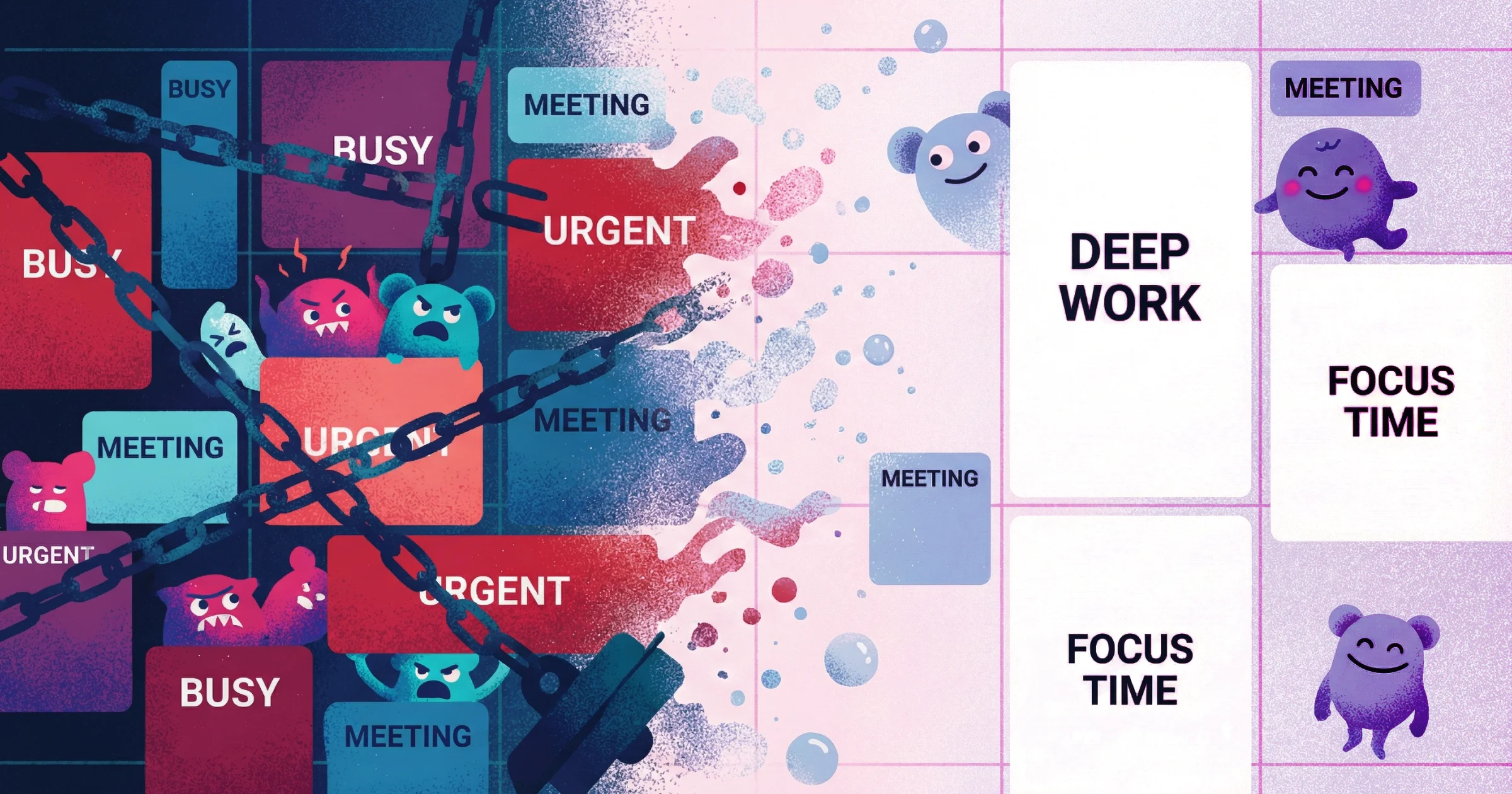
Form-Based Customer Feedback Collection Tools
Form tools collect structured responses through surveys, questionnaires, and input fields. They're the oldest category of customer feedback collection tools and remain the best choice when you need quantifiable data at scale.
When forms work well
Form-based feedback excels when you know exactly what questions to ask and want responses you can aggregate. Customer satisfaction scores (CSAT), Net Promoter Score (NPS), and multiple-choice preference surveys all benefit from form structure.
Strengths:
Scalable to thousands of respondents
Easy to analyze and visualize data
Benchmarkable over time
Low friction for quick responses
Anonymous options available
Representative tools: Typeform, Google Forms, SurveyMonkey, Jotform
When forms fail
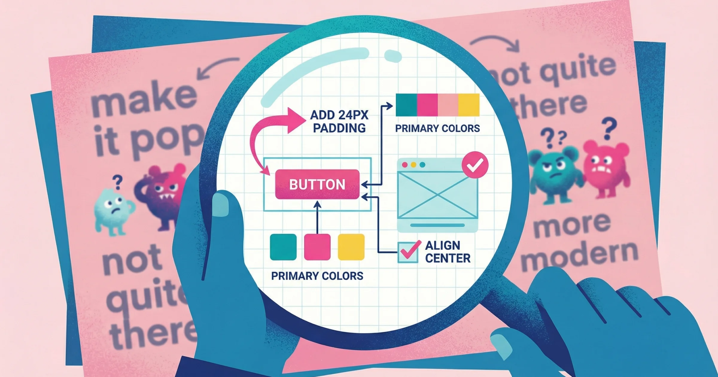
Forms fall apart when the feedback you need is nuanced, visual, or difficult to anticipate. Asking "what do you think of this design?" via a text field produces vague responses because the format forces complex reactions into unstructured text boxes.
I know plenty of designers and agencies that rely on forms to collect feedback. While it can be a reliable process, it's very outdated, and nobody gets excited about filling out a form. It's boring work for your clients.
The bigger problem is what happens without guardrails. I've seen forms become bloated with tons of different feedback fields—and even worse, when a client decides to go rogue and just sends an email instead of using your form, you get a wall of text that goes in circles. I once received feedback where the client kept writing and writing, essentially saying the same thing in different ways. When we finally got on a call, turns out they actually liked the logo we were working on. It was just one shade of blue that was throwing them off, and they wanted the typography handled differently. Because they were writing the feedback instead of talking through it, they got lost in their own thoughts and it became this meandering wall of text that took me an hour to decode.
This is exactly why written design feedback often fails—clients struggle to articulate visual reactions through text alone.
Limitations:
Can't capture visual context
Leading questions skew results
Open-ended responses are hard to parse at scale
Misses the "why" behind quantitative answers
Response fatigue reduces completion rates on long surveys
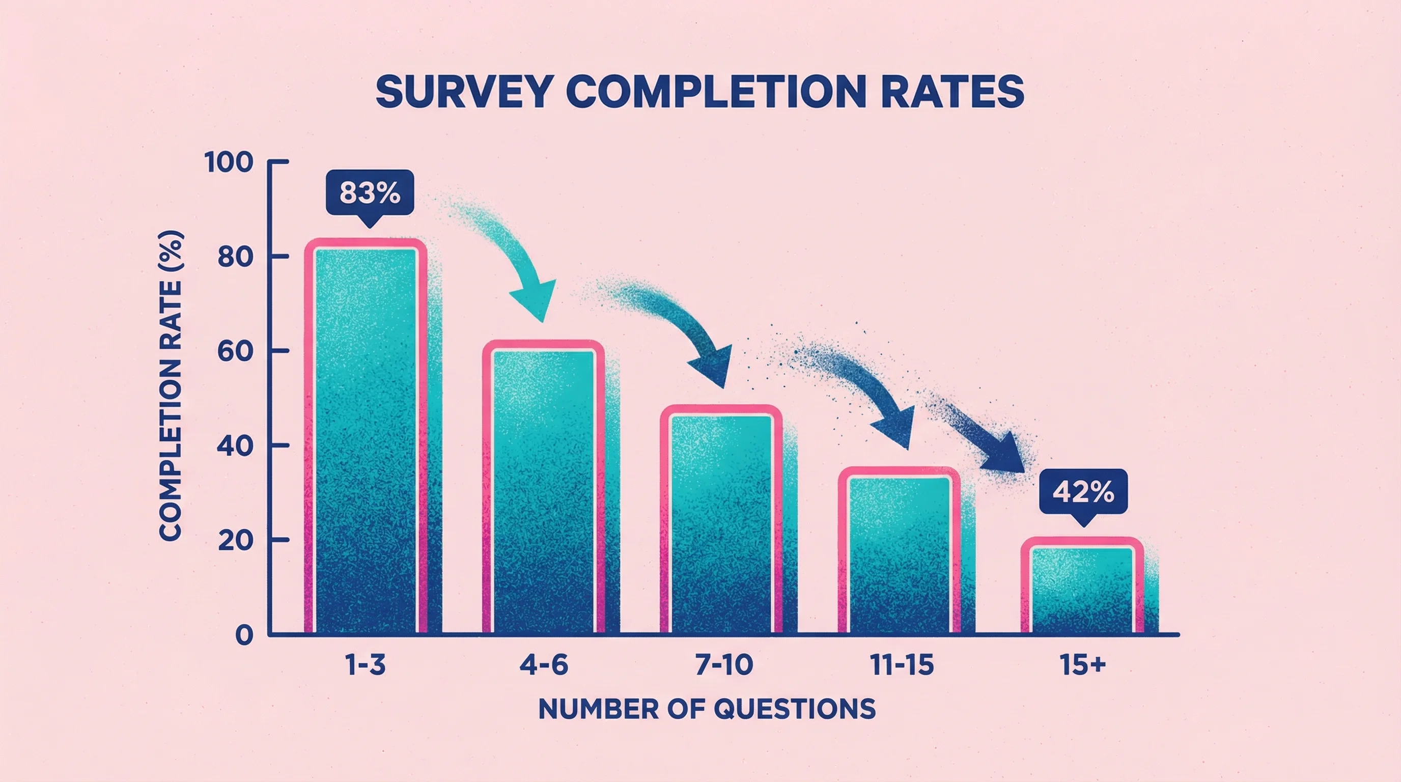
The survey length problem
Survey fatigue is real and measurable. Research analyzing over 267,000 survey responses found that completion rates drop from 83% for 1-3 question surveys down to just 42% when you ask 15+ questions. Every additional question becomes another opportunity for respondents to abandon the feedback.
The problem is even worse on mobile. Studies show that surveys longer than 12 minutes on desktop or 9 minutes on mobile experience drastic drop-off rates. For product feedback tools collecting input from users on the go, this means keeping surveys brutally focused on what you actually need to know.
Best practices for form-based feedback
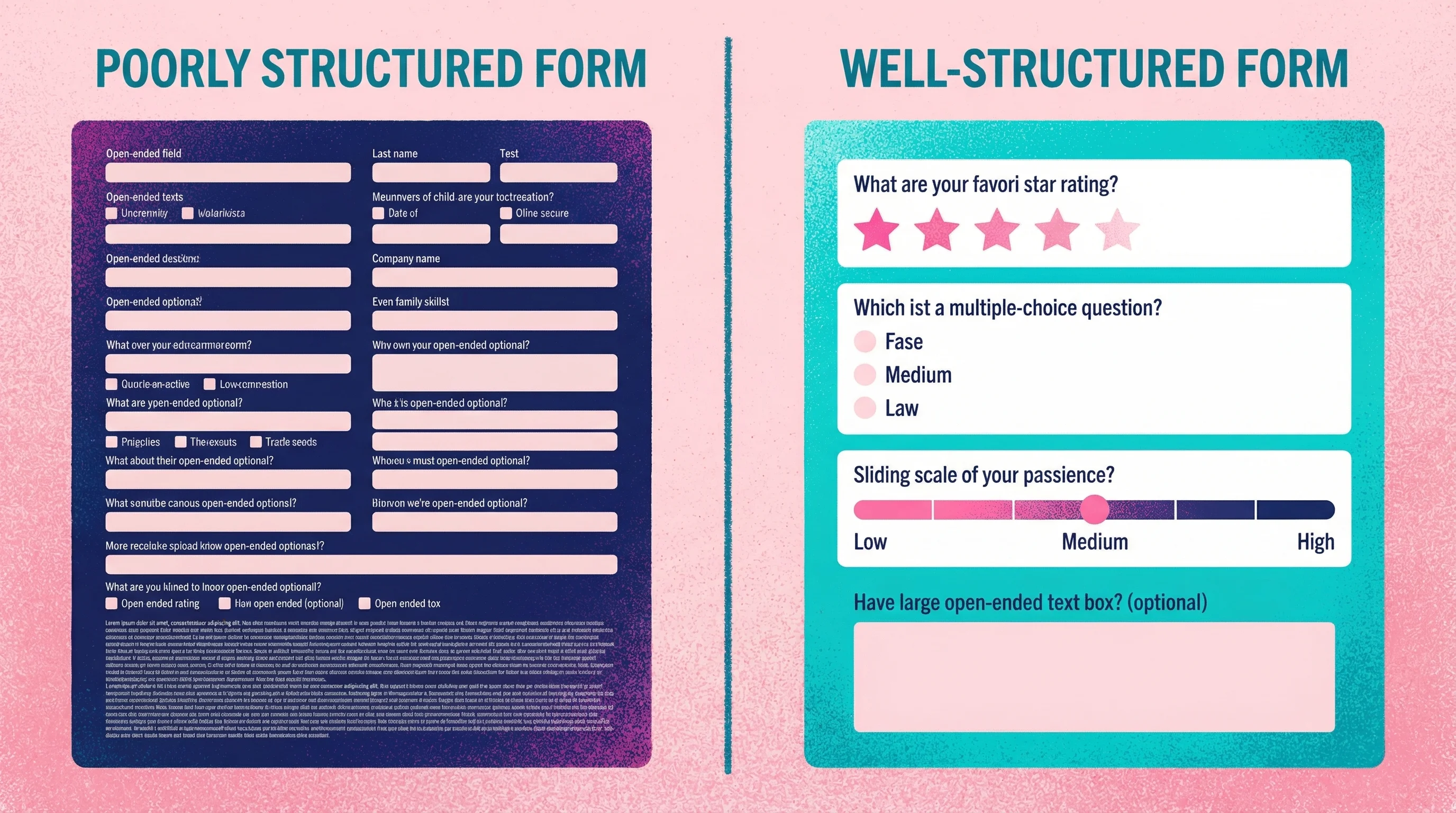
Keep surveys short. For most use cases, 5-10 questions is the maximum before abandonment spikes. If you need more comprehensive feedback, consider breaking it into multiple shorter surveys or mixing in other methods.
Mix quantitative and qualitative strategically. Lead with rating scales (easy for respondents), then follow with optional open-ended questions for those who want to elaborate.
Understanding NPS and CSAT scores:
Net Promoter Score and Customer Satisfaction metrics vary widely by industry, so context matters. Recent benchmark data shows average NPS ranges from around 16 in some sectors up to 80 in others (insurance leads at ~80, while tech and financial services typically sit in the 60s). For CSAT, anything above 70% is generally considered good, with most industries clustering in the 65-80% range.
While high scores often correlate with better business performance—Bain & Company research found that NPS leaders grew roughly 2x faster than competitors—these metrics should be interpreted carefully. They're useful benchmarks but work best when combined with deeper qualitative feedback rather than treated as standalone measures of success.
Video-Based User Feedback Collection Tools
Video feedback captures reviewers talking through their thoughts while showing their screen or pointing at specific elements. It's the closest digital approximation to an in-person review session.
When video works well
Video feedback shines when context and nuance matter more than scale. Design reviews, client revisions, and user research all benefit from seeing exactly what someone is looking at while they explain their thinking.
Strengths:
Captures tone, emphasis, and emotion
Shows exactly what reviewers are referencing
Reveals hesitations and uncertainties text hides
Natural for reviewers (talking is easier than writing for most people)
Creates a record that's easy to revisit
Representative tools: Talki (for collecting video feedback), Loom (for sending video messages), VideoAsk (for interactive video surveys)
If you're specifically looking for Loom alternatives for feedback collection, we've compared 15 options that handle the collection workflow better.
Why video communicates more than text
The difference between video and text feedback isn't just preference—it's measurable. Research comparing feedback modes found that video feedback significantly improved perceived quality, particularly on understandability and encouragement. Participants receiving video responses considered them more personal and easier to grasp because non-verbal cues (facial expressions, gestures, vocal tone) provide context that text alone can't convey.

This gap is exactly why I built Talki. After years of trying to decode written feedback like "this doesn't feel premium enough" or "can we make it more dynamic?", I realized clients weren't being vague intentionally—they just couldn't articulate visual reactions in writing. When I started asking them to record quick videos instead, suddenly "more dynamic" became "when I scroll, nothing moves to catch my eye" with them literally pointing at the static hero section. The clarity was instant.
Studies also show that people tend to give lengthier, more detailed input via video. Video feedback comments are typically longer and more supportive, while text feedback tends to be shorter and focused on specific critiques. This makes video particularly valuable for client feedback tools where understanding the "why" behind reactions matters as much as the "what."
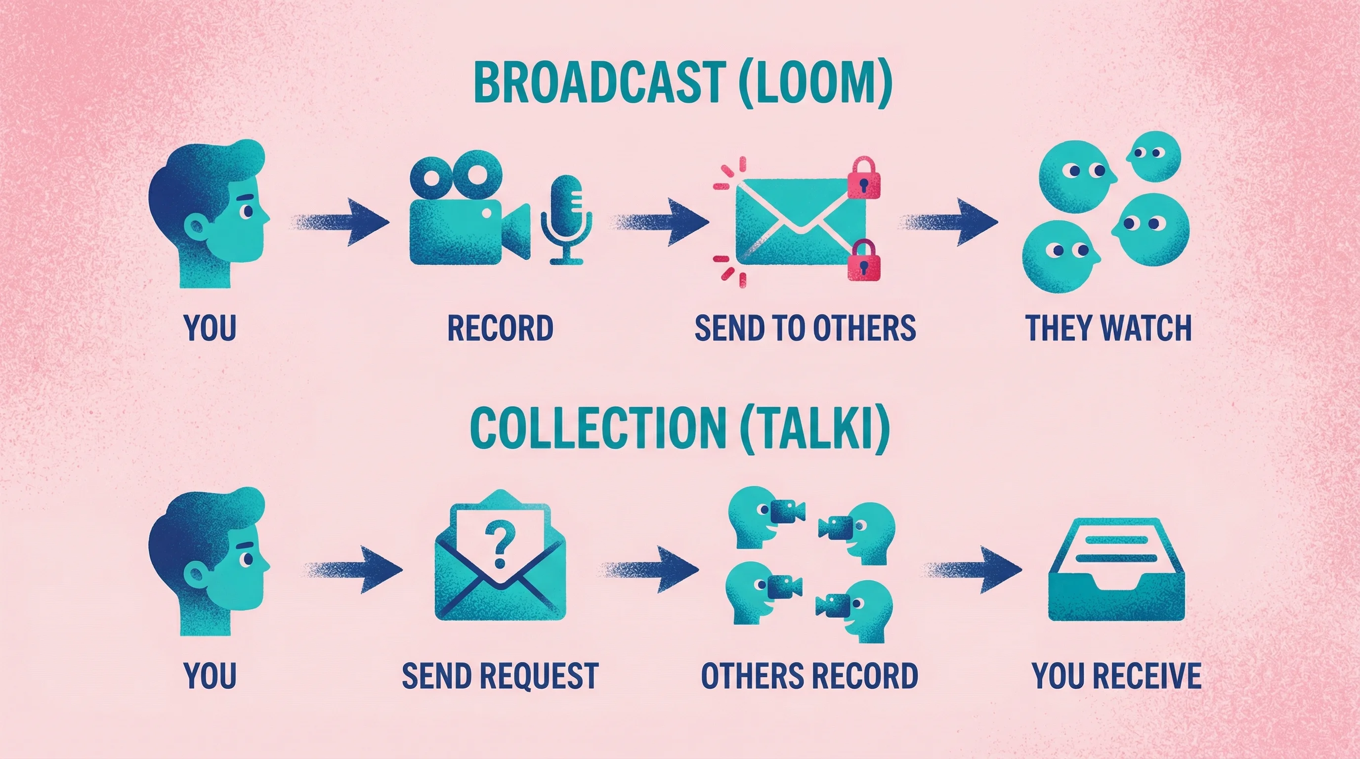
The collection vs. broadcast distinction
Most video tools are designed for broadcasting—you record and send videos to others. But feedback collection requires the opposite flow: others need to easily record and send videos to you.
This asymmetry matters. Loom is excellent for explaining your work to clients, but asking clients to record Loom responses means asking them to create accounts and learn a new tool. The friction kills response rates.
Talki addresses this specifically: Recipients click a link, record their feedback, and you receive the video—no accounts or setup required on their end. The AI transcription means you can skim written summaries when you need quick context, then watch full videos when nuance matters.
When video feedback fails
Video doesn't scale efficiently. Watching 50 video responses takes far longer than scanning 50 form submissions. For quantitative research or high-volume user feedback tools, video adds overhead that isn't justified.
Unlike survey data that can be aggregated quickly, each video must be watched—often multiple times—to extract insights. Analyzing large volumes of video responses is labor-intensive, requiring significant time investment that text-based feedback doesn't demand. Organizations using video at scale need to budget for analyst hours or AI tools to manage the review process.
Video also requires more from respondents, even with low-friction tools. Recording video demands finding a quiet space, using a camera, and being comfortable on video—factors that can deter some people from participating. Someone can complete a five-question form in 30 seconds; recording a video takes at least a minute or two. For quick pulse checks, that's excessive.
Limitations:
Time-intensive to review at scale
Requires more effort from respondents
Harder to aggregate and compare responses
Storage and organization can get unwieldy
Some respondents are camera-shy
Yields unstructured data that resists quantitative analysis
Async Annotation and Comment Tools
Annotation tools let reviewers leave comments pinned to specific locations on designs, websites, documents, or other visual content. They solve the "where exactly?" problem that plagues written feedback.
When annotation works well
Annotation tools excel for design feedback on static visuals or live websites. When you need to know precisely which element someone is referencing, the ability to click and comment beats paragraph descriptions.
Strengths:
Precise location of feedback
Context stays attached to the element
Easy to track resolution of specific issues
Works well for detailed, technical reviews
Supports collaboration among multiple reviewers
Representative tools: Markup.io, Pastel, Figma comments, InVision, Filestage
For design-specific projects, we've compiled the best design feedback tools that combine annotation with other collaboration features.

The speed advantage of visual feedback
Annotation tools dramatically accelerate feedback cycles by eliminating ambiguity. Research on bug tracking shows that bugs reported with annotated screenshots or screen recordings get fixed about 25% faster than text-only bug reports. The visual context helps developers immediately see the issue without back-and-forth clarification.
Teams using integrated annotation workflows report resolving issues almost twice as fast as those relying on written descriptions alone. Instead of receiving "20 emails with conflicting feedback," centralized annotated reviews show exactly what each stakeholder is referencing. This reduces misinterpretation and prevents errors caused by working on outdated information.
When annotation fails
Annotation solves the location problem but not the description problem. Reviewers can show you exactly where they have feedback, but they still need to articulate what's wrong in writing. "This feels off" pinned to a specific button is more useful than "this feels off" in an email, but it still leaves you guessing.
Limitations:
Still relies on written articulation
Can feel cluttered on complex designs
Less effective for motion or interactive content
Some tools require accounts or setup
Doesn't capture tone or nuance
Side-by-Side Comparison
Factor | Forms | Video | Annotation |
|---|---|---|---|
Best for | Quantitative data, surveys, large audiences | Nuanced feedback, client reviews, user research | Design reviews, website feedback, document editing |
Captures visual context | No | Yes (screen recording) | Yes (pinned locations) |
Captures tone/emotion | No | Yes | No |
Scalability | Excellent | Poor | Moderate |
Respondent effort | Low | Moderate | Low-Moderate |
Analysis effort | Low (quantitative) to High (open-ended) | High | Moderate |
Friction for respondents | Very low | Low-Moderate | Low-Moderate |
Tool recommendations by use case
Client design reviews: Video (Talki) or annotation (Markup.io, Figma)
Video captures the "why" behind feedback; annotation works when issues are specific and locatable. For clients who consistently struggle to articulate feedback, video usually produces better results. Learn more about which video feedback tools actually get used in our head-to-head comparison.
Customer satisfaction: Forms (Typeform, SurveyMonkey)
Quantitative NPS or CSAT scores need the structure and scalability of form tools. Add optional open-ended questions for qualitative color.
User research: Video (Talki for async, dedicated UX research tools for moderated)
Watching users interact with your product while explaining their thought process reveals insights surveys can't capture.
Website QA and bug reports: Annotation (Markup.io, Pastel)
Testers need to show exactly where bugs occur. Pinned comments with screenshots are more actionable than text descriptions.
Team feedback on documents: Annotation (Google Docs comments, Filestage)
Inline comments keep feedback attached to specific passages, making review and resolution straightforward.
Choosing the Right Tool for Your Use Case
Start with what you're trying to learn
Before evaluating tools, clarify the feedback you need. Are you measuring satisfaction (forms)? Understanding detailed reactions (video)? Identifying specific issues with specific elements (annotation)?
Consider your respondents
Who's giving feedback changes which tool works best. Internal team members can handle more complex tools; external clients need zero friction. Technical users might prefer precise annotation; non-designers often communicate better through video.
The friction factor
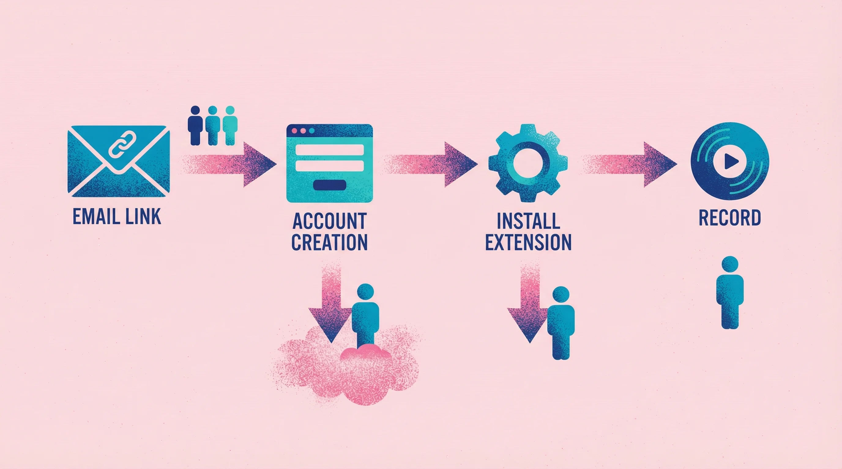
Requiring users to create accounts or navigate multi-step processes dramatically lowers participation rates. Research confirms that surveys which are easy to access—no login required—see significantly higher response rates. For external stakeholders like clients reviewing designs, an account barrier can be fatal.
I learned this lesson the hard way. On one project, I sent a Loom link to 3 stakeholders asking for feedback on design concepts. Only 1 actually had Loom already and sent a video response. The other two? Radio silence. When I followed up, they admitted they didn't want to create yet another account just to leave feedback. The tool became the obstacle instead of the solution.
Every additional step in a feedback process is a potential exit point. If users must install a browser extension, grant permissions, or fill out lengthy onboarding before they can comment, many will quit before finishing. Web surveys shown to already-logged-in users can achieve response rates of 60-70%, versus much lower rates for surveys requiring separate login or sign-up.
The best client feedback software eliminates these barriers entirely. Embedded feedback widgets, guest responses, and simple email links to quick forms get far more uptake than asking people to learn a new tool login.
Factor in volume
How much feedback will you collect? High-volume scenarios favor forms for efficient aggregation. Low-volume, high-stakes feedback (like client revisions) justifies video's higher review time.
Account for your workflow
Where does feedback fit in your process? Tools that integrate with your project management stack reduce friction. Standalone tools with export options work when you need flexibility.
The hybrid approach
Many teams use multiple feedback methods depending on the stage and type of input needed. Combining feedback modes—surveys plus video interviews plus observational studies—produces more reliable and well-rounded insights than any single method alone.
UX researchers call this triangulation: using multiple data sources to enhance the credibility of a study. The core idea is that every method has limitations—surveys might lack depth, interviews lack scale, analytics lack context—but using them together lets one method's strength compensate for another's weakness.
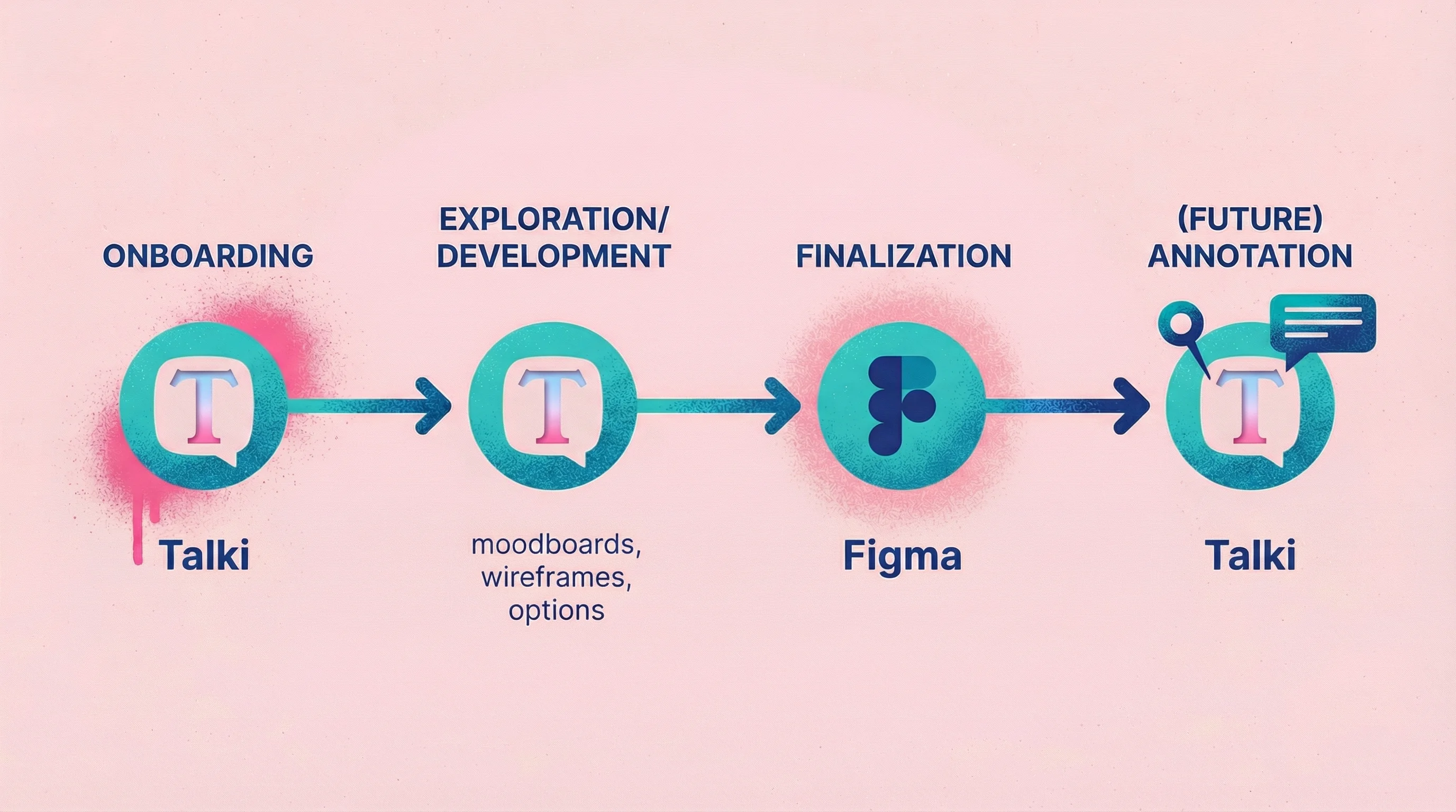
In my own projects, I've evolved to a stage-based approach. I use Talki for client onboarding—this allows me to warm up the client and not worry about staying within the questions of a form. It lets them speak freely and openly, and sometimes get weird. The good type of weird that gives a designer like me ammunition to really push the project to a new place.
I continue using Talki throughout the project when we're in the development phase—think moodboards, wireframes, options. Anywhere we're exploring and I need to understand reactions and thought processes, not just spot specific issues. Then when it comes down to finalizing small details in development or final phases, I switch to Figma comments for precise, technical feedback on specific elements.
This will soon change once we build out annotation tools within Talki so I can keep my feedback collection in one place, but the principle remains: match the tool to the stage and type of feedback you need.
Example workflow for a design agency:
Initial research: Video feedback from stakeholders about brand preferences
Concept feedback: Annotation on design comps
Revision rounds: Video collection for nuanced client reactions
Final approval: Simple form confirmation
This mixed approach not only increases confidence in findings but often uncovers insights that would be missed by a single method. When different methods converge on the same conclusion, stakeholders trust the results more, easing buy-in for product decisions.
FAQ
What's the best feedback collection tool for small teams?
For versatility on a budget, combine a free form tool (Google Forms or Typeform's free tier) with a video feedback tool free option like Talki. This covers both quantitative surveys and nuanced feedback without significant cost.
How do I get more people to complete feedback requests?
Reduce friction. Every click, field, and required account reduces completion rates. For video, use tools like Talki that don't require respondent accounts. For forms, keep surveys under 5 minutes. For annotation, send direct links that don't require logins.
Can I use video feedback for user research?
Yes—async video feedback works well for remote user research where synchronous sessions aren't practical. Ask users to record themselves completing tasks while thinking aloud. Tools like Talki make it easy to collect these recordings without scheduling live sessions.
How do I organize feedback from multiple sources?
Most teams find that consolidation matters more than tool choice. Pick one primary location (your project management tool, a dedicated feedback folder, or your feedback tool's dashboard) and route all input there. Scattered feedback across email, Slack, and various tools creates chaos regardless of individual tool quality.
Conclusion
Forms scale, video captures nuance, and annotation shows location. The right feedback collection tool depends on what you're trying to learn, who you're asking, and how much feedback you'll receive.
For most teams dealing with client feedback on visual work, video collection fills a gap that forms and annotation leave open—the ability to hear exactly what someone means while seeing what they're looking at.
Test the fit. Most tools offer free tiers. Try your top candidate on a real project before committing, and pay attention to how respondents react to the experience, not just the feedback you collect.